The standard user interface used by most programs was designed at a time when computer graphics were slow, monitors had poor resolution (and no one used more than one monitor). In the future, we will be using wall-sized displays or several monitors.
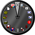
Constantly having to move the mouse to the top of the window (or screen!) and back to our work takes time, and more importantly, it distracts us from our work. In our new user interface, everything happens where the mouse is. A right click brings up the circular menu shown above - just drag the mouse far enough that the searchlight points to the icon you desire and release the button. This is quick and requires little movement away from your work.
We do provide a top menu bar if you wish, although it can easily be turned off. It is used to make it easy to find seldom-used commands, and as a bridge from the old to the new way of doing things. You can of course customize the menu completely, and switch easily between different menus.

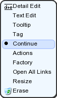
If you right-click on any object in the document, a menu pops up listing things you might want to do with that object. No need to run a command and pick the object first.
Tabbed pages within one window may save screen space, but they prevent easy reference between different documents, views, and pages. It is hard to drag information from one tabbed page to the next.
Our new user interface lets you keep multiple documents, and views of documents, open at once, with each view having its own window. This lets us work with documents much like we work with paper - scattered all over our desk for quick reference. We can make the best use of large and multiple monitors (If you haven't tried using multiple monitors, please do so - you will never want to do without them once you've tried them - and most computers already support them).
Sales (800) 874-4028 e-mail: support@fastcad.com
Other product names mentioned herein are trademarks or registered trademarks of their respective companies.
©1998-2009 Evolution Computing, Inc. All Rights Reserved.